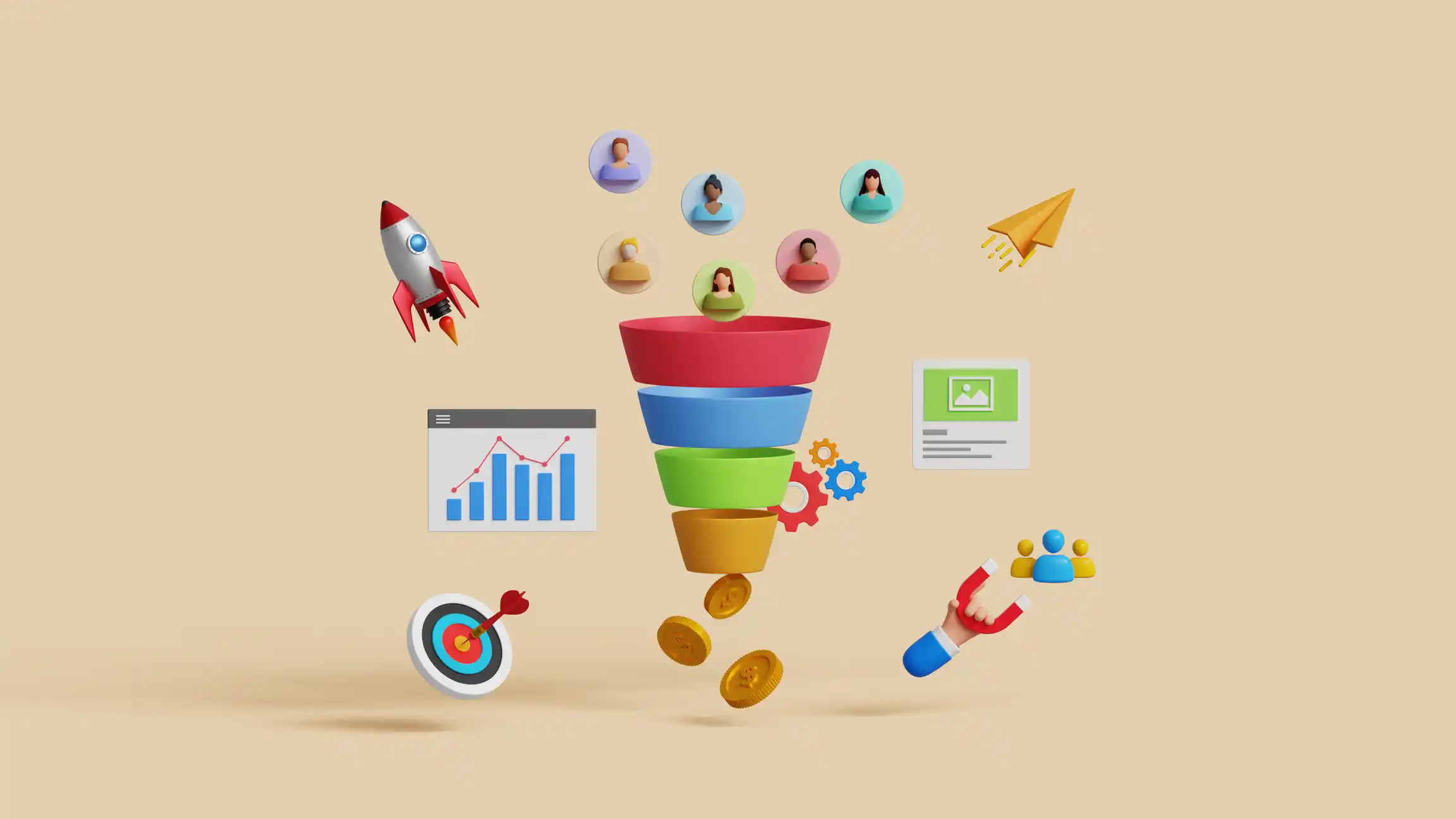
Your website isn’t just a digital brochure, it’s the central hub where your entire marketing funnel converges. Effective website design Surrey aligns with each customer journey stage, guiding visitors from initial awareness through consideration and conversion. When design elements strategically support this progression, conversion rates improve naturally without aggressive sales tactics that might otherwise alienate potential customers.
Awareness stage
The top of your marketing funnel focuses on attracting visitors and making memorable first impressions. Design elements supporting this stage must prioritise immediate clarity and engagement. Visual hierarchy guides visitors’ eyes to the most critical information first, while distinctive typography and colour schemes reinforce brand identity within seconds of arrival.
Header designs should instantly communicate your value proposition through concise headlines and supporting visuals. Navigation menus need an intuitive organisation that helps new visitors quickly understand your offerings without feeling overwhelmed. These elements reduce bounce rates by assuring visitors they’ve arrived at the right place to solve their problems or meet their needs.
Mobile responsiveness becomes particularly crucial at this awareness stage since many initial interactions happen on smartphones during brief moments of availability. Sites that render poorly on mobile devices create negative first impressions that are difficult to overcome later, regardless of how valuable your offerings might be.
Consideration stage
Design elements should shift toward building credibility and facilitating comparison as visitors move into the consideration phase. This middle-funnel stage is where thoughtful information architecture proves its worth. The content organisation should mirror your prospects’ natural evaluation process when assessing solutions.
- Case studies presented with before/after visuals rather than text-heavy descriptions
- Product comparison tools with consistent metrics across options
- Testimonials featuring authentic photography rather than stock images
- FAQ sections with expandable answers that prevent information overload
- Interactive elements that encourage exploration without commitment
White space becomes a powerful tool during this consideration phase, giving important information room to breathe and preventing cognitive overload. Strategic white space around key points increases information retention by up to 20%, helping visitors remember what differentiates your offerings when comparing alternatives.
Decision stage
The bottom of your marketing funnel is converting interested prospects into customers or clients. Design elements at this stage should eliminate hesitation and simplify action. Forms requesting information should include only essential fields, with clear progress indicators for multi-step processes. Call-to-action buttons deserve special design attention with high-contrast colours, adequate size for easy clicking, and positioning that follows the natural eye-scanning pattern.
Checkout processes benefit from minimalist design approaches that remove distractions and potential exit points. Each step should appear achievable, with persistent indicators showing how close users are to completion.
Post-conversion
The marketing funnel doesn’t end at conversion—it extends to retention and advocacy. Design elements supporting this extended funnel include:
- Personalized dashboards showing progress or usage
- Easily accessible support resources with consistent design language
- Visual prompts for reviews or referrals at moments of success
- Community features with intuitive participation mechanisms
- Clear pathways to complementary offerings
These post-conversion design elements transform one-time customers into repeat buyers and brand advocates, completing the full potential of your marketing funnel.
Effective funnel-supporting design maintains visual and functional consistency across all stages. Dramatic changes in the design language between awareness and decision stages create cognitive friction that interrupts the buyer’s journey. Colour schemes, typography, navigation patterns, and interactive elements should evolve subtly between funnel stages while maintaining a cohesive identity that builds familiarity and comfort as visitors move closer to conversion.